You worked hard for that traffic. Someone watched your video, read your post, or scanned your profile, and then did the rarest thing on the internet: they actually tapped your link. That single tap is the whole point of your bio. And yet, for most creators and brands, this is exactly where clicks quietly leak away, not through one obvious disaster, but through a handful of small, invisible mistakes that add up to a bio that underperforms every single day.
None of the mistakes below will throw an error message. Your page still loads, your links still work, everything looks "fine." That is precisely why they are dangerous. Below are the most common ones, what each one silently costs you, and the exact fix.
Why this matters Your link in bio is often the ONLY clickable destination you get on platforms like Instagram and TikTok. It is the single doorway between attention and action. A 5% improvement here compounds across every post you will ever publish. |
Mistake #1: Cramming in too many links
The instinct is understandable — you have a shop, a newsletter, a YouTube channel, three affiliate offers and a podcast, so you list them all. But every extra link you add lowers the odds that any single one gets clicked. This is choice overload: when people face too many options, the easiest decision becomes making no decision at all.
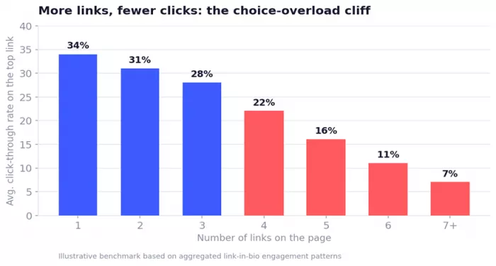
Chart 1 — Click-through on the primary link falls off a cliff once you pass 3–4 options.
The fix: ruthlessly prioritise. Ask what the ONE action is that you want most visitors to take this month, and lead with it. Aim for three to five links, not ten. Everything else can live one layer deeper or wait for its turn at the top.
Mistake #2: Burying your most important link
Order is not neutral. The link at the top of your bio does the vast majority of the work, and each position further down loses clicks fast. If your best offer sits at position four "so it flows nicely," you are hiding your money-maker below your least important links.
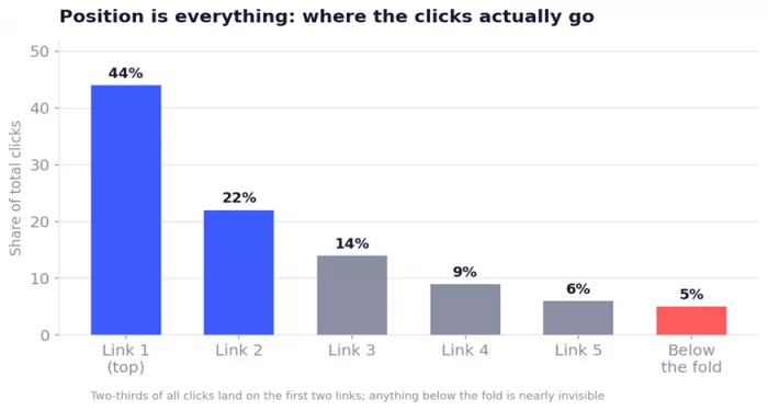
Chart 2 — The top two links absorb roughly two-thirds of all clicks. Below the fold is nearly invisible.
Rule of thumb Put your highest-priority link first, above the fold, where it is visible without scrolling. Never make people hunt for the thing you most want them to do. |
Mistake #3: Vague, lazy link labels
"Website." "Click here." "Link." These labels tell people nothing about what happens after the tap, so they hesitate — and hesitation is a click you just lost. A good label answers two questions at once: what will I get, and why should I care?
Before and after
| Weak label (what most people write) | Strong label (what earns the click) |
|---|---|
| Website | Read the full guide (free) |
| New video | Watch: how I gained 10k in 30 days |
| Shop | Get 20% off, this week only |
| Newsletter | Join 8,000 readers ,1 email/week |
| My course | Start the free 5-day mini-course |
Notice the pattern: a strong label pairs a clear benefit with a reason to act now (a number, a deadline, a proof point, or "free"). It reads like a promise, not a filing cabinet.
Mistake #4: Ignoring mobile load speed
Nearly all of your bio traffic is on a phone, often on patchy mobile data. Heavy background images, autoplay video, bloated third-party widgets and slow redirects all add seconds and every extra second bleeds visitors before your links even appear. People bounce back to the app long before they see what you offer.
• Keep the page lightweight — compress images, skip autoplay video, drop widgets you do not need.
• Test it yourself on mobile data, not just office Wi-Fi.
• Minimise redirects between the tap and the destination.
Mistake #5: Breaking the promise (context mismatch)
Someone taps your bio because of a specific post — the recipe, the deal, the announcement. If they land on a generic homepage that says nothing about what brought them there, they feel the mismatch instantly and leave. This is the single most common reason clicks convert to nothing: the landing page does not match the reason for the tap.
The fix Match the destination to the moment. When you promote something in a post, update the top link so it points exactly there. "Message-to-page match" is the difference between a warm visitor and a confused one. |
Mistake #6: Dead, broken and outdated links
Expired discount codes. A sold-out product. A link to last year's event. A typo'd URL that 404s. Every dead link is a visitor who was ready to act and hit a wall and worse, it makes your whole brand look neglected. Trust drops, and so does the next click.
Fix it with a simple habit: audit your bio on a fixed schedule (say, the first of every month), tapping each link on a real phone to confirm it goes exactly where it should.
Mistake #7: No tracking: you are flying blind
If you cannot see which links get clicked, you are guessing. You will keep promoting things nobody taps and quietly ignoring the ones that quietly convert. What you do not measure, you cannot improve.
• Add UTM parameters or use your bio tool's built-in analytics so every click is attributed.
• Review click data monthly, promote the winners to the top, cut the dead weight.
• Track the full funnel where you can: not just clicks, but what happens after.
Mistake #8: Zero branding or trust signals
A bare list of blue links on a white page looks like it could belong to anyone — or to a scam. People click when they feel they are in the right place. Missing your logo, your face, your colours, or any hint of social proof makes visitors second-guess the tap.
• Use your own colours, logo and a recognisable profile image so the page feels unmistakably yours.
• Add light social proof, follower counts, "as seen in," a short testimonial, or star ratings.
• Keep it clean: consistent spacing and one visual style beats a cluttered rainbow.
Mistake #9: No visual hierarchy
When every link looks identical, the eye has nothing to latch onto and treats them all as equally optional. Give your priority link visual weight, a bolder colour, a button style, an icon so it is obvious where to tap first. Design should do the deciding for the visitor.
Mistake #10: Set it and forget it
A link in bio is not a monument; it is a living storefront window. If it says the same thing for six months while your content, launches and offers keep changing, it slowly drifts out of sync with everything you are actually doing — and every drifted day costs clicks. Treat it as something you tune, not something you install once.
Quick reference: mistake → cost → fix
Keep this table handy the next time you open your bio editor.
| The mistake | What it quietly costs you | The fix |
|---|---|---|
| Too many links | Choice overload; nobody picks anything | Trim to 3–5; lead with one priority |
| Priority link buried | Your best offer gets the fewest clicks | Put it first, above the fold |
| Vague labels | Hesitation kills the tap | Benefit + reason to act now |
| Slow on mobile | Visitors bounce before links load | Compress, cut widgets, test on data |
| Context mismatch | Warm visitors feel lost and leave | Match the link to the post that sent them |
| Dead / stale links | Ready-to-act clicks hit a wall | Audit on a fixed monthly schedule |
| No tracking | You optimise blind | UTMs + monthly click review |
| No branding | Looks generic or untrustworthy | Logo, colours, social proof |
| Flat hierarchy | Eye has nowhere to land | Give the top link visual weight |
| Never updated | Bio drifts out of sync with you | Treat it as a living storefront |
Your 60-second bio audit checklist
Open your link in bio right now, on your phone, and run through this list. If you cannot tick every box, you have found your leak.
☐ My single most important link is first and visible without scrolling.
☐ I have five links or fewer.
☐ Every label states a clear benefit and a reason to act.
☐ The page loads fast on mobile data.
☐ My top link matches whatever I am currently promoting.
☐ Every link works and points to the right, current destination.
☐ I can see click data for each link.
☐ The page looks unmistakably like my brand.
☐ The priority link stands out visually from the rest.
☐ I have a recurring reminder to update and re-audit this page.
The bottom line None of these mistakes will ever announce themselves. Your bio will keep looking fine while it quietly underperforms. Fix the ten leaks above and the same traffic you already earn will start converting into the clicks and customers, it was always meant to. |



Comments