“Link in bio” appears beneath product videos, creator posts, news updates and promotional content across social media. The instruction is simple: visit the account’s profile and click the link displayed there. What happens after that click, however, determines whether the link is useful or merely present.
A well-planned bio link connects social media attention to a clear next step, whether that means reading an article, buying a product, joining a newsletter, booking a service or downloading a resource.
What “Link in Bio” Means
A link in bio is a clickable web address placed within the profile section of a social media account. When someone writes “link in bio” in a caption, video or comment, they are directing the audience to open the account profile and select that link.
The word “bio” refers to the short biography or description shown near an account’s profile image, username and follower information. Depending on the platform, the link may appear directly below the written biography, inside a dedicated website field or within a separate links section.
The link can lead to almost any relevant online destination, including:
● A product or service page connected to the content being promoted.
● A blog article, video, podcast episode or downloadable guide.
● A booking page for consultations, appointments or reservations.
● A newsletter subscription form or membership page.
● A portfolio, online store, event page, menu or media kit.
● A landing page containing several organised links.
The phrase is often treated as a minor social media convention, but it describes an important movement between platforms.
The complete journey usually follows this path:
Social post → profile visit → bio link → external page → desired action
Each stage has a specific job. The post creates interest. The profile confirms relevance and trust. The link directs the visitor. The destination completes the promise.
If any part of that sequence is unclear, people are more likely to leave before taking action.
Why Social Media Uses Bio Links
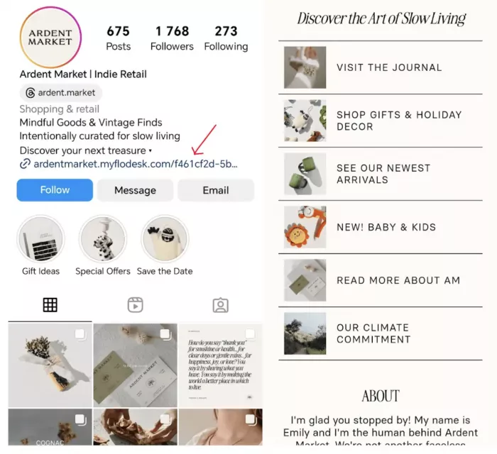
Most social platforms are designed to keep people watching, reading and interacting inside the app. External links interrupt that behaviour by sending users elsewhere.
For this reason, links are not always equally available across captions, videos, comments and ordinary posts. A URL may appear as plain text rather than a clickable address, or clickable links may be limited to certain account types and placements.
The profile offers a more stable location. It remains attached to the account even as new posts replace older ones in the feed.
This is why creators and businesses began using the phrase “link in bio.” Instead of placing a long web address in every caption, they direct people to one consistent location.
The method also creates a challenge. Clicking a bio link requires more effort than clicking a link directly inside a post. A person must leave the content, open the profile, identify the correct link and wait for another page to load.
That additional effort makes clarity essential. The reason for clicking should be strong enough to justify the extra steps.
The Role of the Bio Link
A bio link acts as a bridge between discovery and action. Someone may discover a brand through a short video, learn about a service through a carousel post or find a creator through a shared reel. The social content introduces the subject, but it rarely contains everything needed to complete the next step.
The bio link moves the person to a page where that next step becomes possible.
For example, a restaurant may publish a video showing a seasonal menu. The post creates interest, but the viewer still needs prices, opening hours, location details and a reservation option. A well-chosen bio link can take the viewer directly to that information.
A poorly chosen link may open the restaurant’s general homepage, forcing the visitor to search through several menus. The link technically works, but the journey is inefficient.
A useful bio link should answer three questions:
1. Why should someone click it?
2. What will they find after clicking?
3. What should they do on the destination page?
The answer should be visible before the visitor has to think about it.
Where Bio Links Appear
The exact placement differs between platforms. Some profiles support one prominent website field, while others allow several labelled links or additional linking options through posts, stories, descriptions and profile sections.
| Platform | Typical profile placement | Common uses |
| Profile links section beneath the bio | Products, campaigns, articles, booking pages and link hubs | |
| TikTok | Website or links area within the profile | Online stores, music, creator pages and external content |
| YouTube | Channel profile links and video descriptions | Websites, memberships, merchandise and related content |
| Contact details, profile sections or custom buttons | Portfolios, company websites, newsletters and booking pages | |
| X | Website field in the account profile | Articles, newsletters, projects and personal websites |
| Website field and linked Pins | Stores, blogs, recipes, product pages and visual collections |
Linking features can vary according to account type, subscription, device, region and platform updates. The interface visible to one user may not be identical to the interface available to another.
The strategic principle remains the same: the profile link should support the content people are currently seeing.
How to Add a Link
Although menu names vary, the general process is similar on most social platforms.
1. Open the profile editor
Visit the account profile and select an option such as Edit Profile, Customize Channel, Contact Information or Profile Settings.
2. Find the website or links field
Look for a section labelled Website, Links, External Link, Contact Info or something similar. A URL pasted into the written biography may not become clickable, so it should be placed in the dedicated link field whenever possible.
3. Add the complete URL
Use the full address, including the secure https:// prefix. Confirm that the URL does not contain typing errors, expired tracking information or unnecessary characters.
4. Add a useful label
Some platforms allow the link to be named. Use a label that describes the destination rather than repeating the brand name.
“View service packages” is more useful than “Visit website.”
“Download the free planner” is clearer than “Learn more.”
5. Save and test the profile
Open the public version of the account and click the link. Test it on a phone because most social traffic is mobile. Check that the destination loads quickly, displays correctly and immediately shows the information promised in the post.
This final step is frequently overlooked. A link can appear correct in the editing screen while pointing to an unpublished, outdated or restricted page.
Choosing the Right Destination
The best destination depends on the reason the audience is visiting the profile.
A common mistake is sending every visitor to a general homepage. A homepage serves several purposes and several audience groups. Someone arriving from one specific post usually has a narrower intention.
If a video promotes a particular jacket, the most relevant destination is the jacket page or featured collection. If a post offers a free guide, the link should open the guide’s download page. If a consultant discusses a service, the link should lead to a page explaining that service and how to enquire.
The destination should continue the subject introduced by the content.
Consider the difference between these two journeys:
Weak journey: Product video → profile → general homepage → store menu → category page → product
Stronger journey: Product video → profile → featured product page
The second path reduces searching, confusion and unnecessary decisions.
Suitable destinations include:
● A focused product page for an item shown in recent content.
● A category page when several related products are featured together.
● A landing page created for a specific campaign or promotion.
● A service page that explains scope, pricing and the next step.
● A booking calendar for appointments, consultations or reservations.
● A subscription page that explains what subscribers will receive.
● A content page containing the article, episode or guide being discussed.
The page should not merely relate to the account. It should relate to the reason someone clicked.
Direct Link or Multi-Link Page
A profile can link directly to one destination or to a page containing several buttons.
Neither approach is automatically better. The correct choice depends on how many active priorities the account needs to support.
| Direct link | Multi-link page |
| Best for one focused campaign or offer | Best for several ongoing destinations |
| Creates fewer decisions for the visitor | Allows products, content and contact options to coexist |
| Reduces the number of steps before conversion | Supports older posts that refer to different resources |
| Requires frequent updating when campaigns change | Requires careful organisation and regular cleanup |
| Works well for launches, registrations and specific products | Works well for creators, publishers and multi-service businesses |
A direct link is usually stronger when one action matters most. A conference organiser selling tickets, for example, should generally link directly to the registration page.
A multi-link page is useful when the account serves different visitor needs. A musician may need links for a new release, upcoming performances, merchandise and a mailing list. A freelance professional may need a portfolio, service page, booking calendar and contact option.
The risk is overcrowding. A page with fifteen or twenty buttons may offer more destinations but provide less direction. Visitors must decide which link matters, and the current priority can disappear among older items. A multi-link page should be treated as a small navigation system, not an archive.
Writing a Bio That Supports the Link
The URL does not work alone. The words around it should explain what the account offers and why the link is relevant.
An effective social media bio usually contains three elements:
Identity: what the person, business or organisation does.
Value: what the audience can expect from the account.
Action: what the visitor can do through the link.
Consider a freelance designer.
Generic bio: Creative designer helping businesses grow. Click below.
More useful bio: Brand identity designer for independent food and retail companies. View recent projects and current availability below.
The second version is stronger because it identifies the service, intended client and purpose of the link. It gives the visitor enough information to decide whether the destination is relevant.
The action line should also match the current URL. A profile that promises a free checklist should not direct people to a paid consultation page. Even when both offers belong to the same business, the mismatch weakens trust.
Useful action lines include:
● View current packages and project availability.
● Download the free content planning template.
● Read the full research report.
● Browse the collection featured in our latest posts.
● See the menu and reserve a table.
● Join the weekly newsletter.
The wording should describe a result rather than simply telling people to click.
Creating a Better Link Page
A multi-link landing page should make navigation easier than the main website.
The most important link should appear first. If the account is currently promoting a product launch, event or new article, that destination should be visible before permanent links such as the About page or general contact information.
Button labels should be specific.
“Latest update” may be unclear but “Read the July platform update” is precise.
“Shop” is understandable but broad and “Shop the summer collection” gives more context.
The page should also confirm that the visitor has reached the correct destination. Use the same name, profile image or recognisable branding shown on the social account. A sudden change in identity, tone or domain can make a legitimate page feel unreliable.
A practical link page often includes:
● A clear name or brand identifier at the top of the page.
● A short sentence explaining what the visitor can find.
● A limited number of links arranged by current importance.
● Descriptive labels that make each destination predictable.
● Contact, privacy and policy information when relevant.
● A mobile layout with readable text and comfortably sized buttons.
Remove old promotions, unavailable products and expired events. A link page should reflect the account’s current activity.
Writing Better Calls to Action
“Link in bio” tells people where to click. It does not explain why they should click. A complete call to action combines the location with a clear benefit.
Weak: More information in the link in bio.
Stronger: Compare the available plans and see current pricing through the link in our bio.
Weak: Check the link in bio.
Stronger: Download the printable travel checklist from the first link in our bio.
Weak: Shop now through the bio.
Stronger: View the sizes and colours shown in this video through the product link in our bio.
The stronger versions reduce uncertainty. The audience knows what information will appear after clicking.
Calls to action should also match the level of interest created by the content. A general educational post may lead naturally to a guide or newsletter. A detailed demonstration may be strong enough to lead directly to a product page or booking form. The next step should feel like a continuation of the content rather than an abrupt sales request.
Using Bio Links for Different Goals
The correct setup changes according to the account’s purpose.
Online stores
An online store should connect posts to the products or collections being shown. The destination should make price, availability, size, colour and delivery information easy to find.
A general store homepage may be suitable for broad brand content, but product-specific posts should use more focused destinations.
Service providers
Consultants, designers, coaches and other professionals can link to service pages, portfolios or booking calendars. The page should explain who the service is for, what it includes and what the visitor should do next.
Sending visitors straight to a calendar without explaining the service may generate poorly qualified bookings.
Restaurants and local businesses
Restaurants can link to menus, reservations, ordering pages or location information. The page should display opening hours, address details and current availability without requiring unnecessary searching.
Creators and publishers
Creators may need a multi-link page because different posts promote different content. The page can include a latest article, newsletter, podcast, store and collaboration information.
The current priority should still be placed first.
Musicians and artists
A musician may use one landing page containing streaming platforms, tour dates, merchandise and mailing-list registration. A visual artist may link to a portfolio, current exhibition or print store.
Event organisers
Event content should lead to a page containing the date, location, schedule, ticket price and registration status. Time-sensitive information should be easy to verify.
Measuring Bio Link Performance
A bio link should be evaluated by what happens before and after the click.
Profile visits reveal how many people were interested enough to leave the post and view the account. Link clicks show how many of those visitors continued to the destination. Website behaviour then shows whether they completed the intended action.
Useful measurements include:
● Profile visits generated by recent content.
● Clicks on the main bio link or individual link-page buttons.
● Landing-page visits and time spent on the page.
● Newsletter subscriptions, downloads or completed forms.
● Bookings, enquiries, purchases or event registrations.
● Performance differences between campaigns and social platforms.
These measurements help identify where the journey is failing.
A post with high engagement but few profile visits may have a weak call to action. A profile with many visits but few clicks may not explain the value of the link. A page with strong traffic but few conversions may load slowly, ask for too much information or fail to match the original content.
Traffic alone is not always the main goal. A professional service may prefer a small number of relevant enquiries to a large number of unqualified clicks.
Common Link-in-Bio Mistakes
● Sending every visitor to a general homepage forces people to search for information that should have been immediately available.
● Adding too many buttons to a multi-link page can hide the current offer beneath older or less important destinations.
● Using labels such as “Click here,” “Explore” or “Latest” makes it difficult to predict what will open.
● Changing the bio link without reviewing older posts can leave active content pointing to the wrong campaign.
● Keeping expired offers, unavailable products or past events visible creates confusion and makes the profile appear neglected.
● Requiring a long form or account registration before delivering a simple resource adds unexpected friction.
● Using unfamiliar shortened URLs without clear branding can make a legitimate destination appear suspicious.
● Ignoring mobile design can make buttons, forms and text difficult to use inside an in-app browser.
Most failures are not caused by a broken URL. They occur because the link opens a page that does not satisfy the visitor’s expectation.
Trust, Privacy and Accessibility
A bio link moves people outside the social platform, so the destination must establish trust quickly.
Use secure pages with HTTPS and a recognisable domain. Keep branding consistent between the social profile and the external page. If the page collects names, email addresses, payment information or other personal data, explain what is being collected and why.
Avoid asking for more information than the action requires. A free download may need an email address, but it should not require unrelated personal details.
Payment pages should clearly show the seller, product, price, currency and important conditions before requesting card information.
Accessibility also affects performance. Buttons should be large enough to tap comfortably on a phone. Text should remain readable without zooming. Link labels should communicate meaning without depending only on colour, icons or surrounding images.
A visitor should be able to understand the page even when using a small screen or assistive technology.
Bottom Line
A link in bio is more than a website address attached to a social profile. It is the connection between attention inside a social platform and action outside it.
The most effective setup keeps the same promise across the post, profile and destination page. Use a direct link when one campaign matters most. Use a well-organised link page when several active destinations need to remain available. Label every link clearly, remove outdated options and test the complete journey on mobile.
When the route is relevant, trustworthy and easy to follow, a small profile link can support product sales, newsletter growth, content discovery, reservations, enquiries and bookings without making the account feel overly promotional.



Comments