A visitor lands on a homepage. Before the web fonts have finished loading, a verdict is already forming. Within the first second the brain has sorted the layout into "professional" or "off". By the fifth second, the visitor has decided whether to keep reading or reach for the back arrow. Nothing below the fold has been seen.
The 5-second test is the research method built around that window. Show someone a page for five seconds, then hide it and ask what they remember. The answers tend to be humbling. Pages that took months to build get described as "some kind of software company, maybe?". A headline the marketing team argued about for weeks turns out to be invisible next to a stock photo of people at a whiteboard.
This article covers what the research says about those first seconds, the four judgments a visitor makes before scrolling, where the eye lands first, and a scoring framework that turns "the page feels weak" into a list of things to fix.
What the 5-second test measures
The method is short enough to describe in a sentence. A participant sees a static screenshot of a page for five seconds. The image disappears, and the participant answers a handful of questions from memory. What was the page about? Who did it seem to be for? What stood out? What would be clicked next?
Five to ten participants are enough to surface the pattern. When six out of eight people cannot say what a product does, the page has a clarity problem that more traffic will not fix. The test grew out of a plain observation by the founder of UsabilityHub (now Lyssna): visitors who leave a site within seconds have not evaluated anything consciously. They reacted. The test captures the reaction before the participant has time to rationalise it.
What the test leaves out matters as much as what it captures. It says nothing about whether the checkout works or whether the pricing is competitive. It is an instrument for a single question: does the page communicate its core message at a glance? A smoke alarm, not a building inspection.
Where the number comes from
Five seconds is a practical compromise rather than a biological limit. The research on first impressions points to windows far shorter than that. The five-second frame simply gives participants enough time to form a memory they can report.
| Study | What was measured | Finding | What it means for a page |
|---|---|---|---|
| Lindgaard et al., Carleton University (2006) | Visual appeal ratings after 50 ms and 500 ms exposures | Ratings at 50 ms matched ratings after longer viewing | Layout and clutter are judged before a word is read |
| Tuch et al. with Google researchers (2012) | Aesthetic judgments at exposures from 17 ms to 500 ms | Visual simplicity shaped appeal even at 17 ms; looking typical for the category mattered from 50 ms | An unusual layout reads as risk; a familiar one reads as safe |
| Fogg et al., Stanford (2003) | Comments from more than 2,500 people on what made sites credible | 46.1% of comments referred to design look; 28.5% to information structure | Trust is decided visually before content is weighed |
| Sillence et al., UK health-site study (2004) | Why people rejected or trusted health websites | 94% of comments behind a rejection were about design; 6% were about content | Accurate content does not survive a poor first impression |
| Nielsen Norman Group | Time spent on pages across a large sample of visits | Most visitors leave within 10 to 20 seconds unless the page proves its value early | The five-second window decides whether the next fifteen seconds happen |
Table 1. The research behind the five-second window.
The Carleton study also documented a halo effect. The snap judgment coloured everything that followed. A visitor who registered "cheap" in the first blink read the rest of the page with suspicion, while a visitor who registered "professional" forgave a typo. The first seconds set the lens through which the whole page gets read.
Four decisions a visitor makes before scrolling
Responses from 5-second tests cluster around four questions. Participants rarely phrase them this neatly, but almost every answer maps onto one of them.
1. Is this the right place?
This is message match. Someone who clicked a search result for "invoice software for freelancers" expects the hero section to say something close to that. When the homepage opens with "Empowering the future of work" instead, the visitor has to translate, and translation costs seconds the page does not have. Paid clicks that land on generic headlines produce the familiar pogo-stick pattern: a click, then straight back to the results.
2. Is this meant for this reader?
Audience fit. A page that tries to serve enterprise procurement teams and weekend hobbyists in the same headline signals neither. Visitors scan for a word that names them: "for accountants", "for Shopify stores", "for teams of five to fifty". When no such word appears above the fold, the reader assumes the page was built for someone else.
3. Can this be trusted?
Credibility. The Stanford Persuasive Technology Lab asked more than 2,500 people what made a website believable and coded every comment. Design look topped the list by a wide margin. Accuracy of the information, the thing most teams assume drives trust, came in sixth.
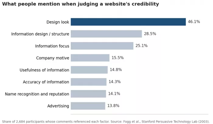
Figure 1. Design-related comments dominated credibility judgments in the Stanford study.
The practical reading is uncomfortable but useful. Visual signals feed the trust decision long before anyone checks a claim. Consistent typography, real photography instead of obvious stock imagery, a recognisable set of client logos, and visible contact details all register inside the window. A cluttered hero with mismatched fonts undoes all four.
4. What happens next?
Path. A visitor who has decided the page is relevant and credible still needs an obvious next step. One primary button, in a contrasting colour, with a verb-first label. Pages that place six equal-weight links in the hero fail this decision even when they pass the other three.
Where the eye lands first
Eye-tracking research at Missouri University of Science and Technology recorded where participants looked when a new page appeared. It took about 2.6 seconds for the eye to settle on the area that most shaped the first impression. The elements that held attention longest were not the ones most teams spend their budget on.
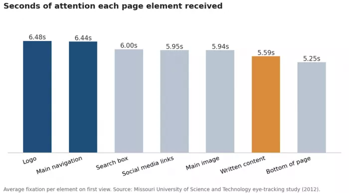
Figure 2. The logo and navigation held attention longer than the written copy.
The logo drew the longest fixation at 6.48 seconds, with the main navigation close behind at 6.44. Written content came in below the search box and below the row of social media icons. The paragraph copy, the part that gets rewritten a dozen times before launch, held less attention than a row of small grey icons.
Two consequences follow. Navigation labels are copywriting, and "Solutions" or "Resources" wastes the second-longest fixation on the page on words that mean nothing. And the main image is doing message work whether or not anyone intended it to; a generic photo of people pointing at a laptop is telling the visitor something, and it is not the intended message.
| Element | What it signals in five seconds | Common mistake |
|---|---|---|
| Logo | Who this is and whether the name is recognised | Tiny logo lost in a busy header |
| Main navigation | What the site offers and how it is organised | Vague labels such as "Solutions" |
| Search box | The site is large enough to need one | Present on a five-page site where it only adds clutter |
| Social media links | The brand is active and reachable | Links to accounts that went quiet a year ago |
| Main image | Category and price positioning | Stock photo that could belong to any industry |
| Written content | The actual claim | Headline written for the company rather than the reader |
| Bottom of page | Legitimacy cues such as an address and policies | No physical address or contact route |
Table 2. What each high-attention element communicates, and where it usually goes wrong.
The 5-Second Scorecard: a four-part framework
Running the test produces a pile of raw answers. The 5-Second Scorecard turns them into a number that can be tracked across redesigns and compared between pages. It scores four criteria, each from 0 to 2, for a maximum of 8 points per participant.
| Criterion | Question asked after five seconds | 0 points | 1 point | 2 points |
|---|---|---|---|---|
| Purpose | What does this page or company do? | Wrong or blank | Partly right ("some kind of software") | Accurate in one sentence |
| Person | Who is this for? | No idea | Broad guess ("businesses") | Names the actual segment |
| Proof | Why would this be trusted? | Nothing recalled | A vague signal ("looked professional") | A specific signal (a client logo or a rating) |
| Path | What would be clicked next? | Cannot say | Guesses a menu item | Names the primary call to action |
Table 3. The 5-Second Scorecard.
Average the totals across participants and read the result against the bands below.
| Average score | What it means | Next move |
|---|---|---|
| 7 to 8 | The page communicates at a glance | Shift testing effort to the sections below the fold |
| 5 to 6 | One criterion is dragging the total down | Fix the weakest criterion and retest |
| 3 to 4 | Visitors are guessing | Rewrite the headline and subhead before touching the design |
| 0 to 2 | The page is illegible at a glance | Rebuild the hero section from scratch |
Table 4. Reading a Scorecard result.
Purpose is the criterion to watch. A page that scores 0 or 1 on Purpose rarely scores well on anything else, because a visitor who does not know what a page is for cannot judge whether it is trustworthy or where to click next. Fix Purpose first, and the other scores tend to rise on their own.
How to run a 5-second test in an afternoon
1. Capture the first screen only. Take a screenshot at a common viewport, 1440 pixels wide for desktop and 390 pixels for mobile, and crop to what is visible without scrolling. Run desktop and mobile as separate studies; a desktop screenshot squeezed onto a phone distorts the hierarchy.
2. Recruit 5 to 10 people who resemble real visitors. Colleagues who already know the product will score it generously. Research tools with participant panels can filter by role and country; a free alternative is to share the test link in a community where the target audience gathers.
3. Show the image for five seconds, then hide it. Dedicated tools enforce the timer. A generic survey tool cannot enforce it, so participants linger and the results stop meaning anything.
4. Ask four open questions. What does this company do? Who is it for? What stood out most? What would be clicked next? Keep them open-ended; multiple choice leaks the answer.
5. Score each response against the Scorecard. Look for the pattern rather than the average. Eight people giving eight different answers to "what does this do" is a clarity failure even if each answer is half right.
Lyssna (the platform formerly known as UsabilityHub) and Maze both run timed five-second studies with built-in participant panels, and UserTesting offers the same format at enterprise scale. At the time of writing, Lyssna's free tier allows up to three active tests with five free responses each, and paid plans start at roughly $75 a month. Plan details change, so check the vendor's pricing page before committing.
Six ways pages fail the test
The same failures show up across industries. The table lists the ones that appear most often in test responses, with the fix that usually moves the score.
| Failure pattern | What participants say | Fix |
|---|---|---|
| Abstract headline ("Work smarter, together") | "Some kind of collaboration thing?" | State the category and the outcome in plain words |
| Rotating hero carousel | Remember the transition, not the message | One static hero; move the other messages further down the page |
| Stock photo of smiling people | "Looked like a bank, or maybe insurance" | A product screenshot, a real customer photo, or no image at all |
| Several equal-weight buttons | Cannot name a next step | One primary button plus one text link at most |
| Logo wall with no context | "Lots of logos, not sure why" | Add a line of context such as "Used by 2,400 accounting firms" |
| Slow load | Blank screen eats into the five seconds | Compress the hero image and keep Largest Contentful Paint under 2.5 seconds |
Table 5. Recurring failure patterns and the fix for each.
The last row deserves a note. A 5-second test runs on a screenshot, so it hides load time. Real visitors experience load time as part of the window. A hero that takes three seconds to paint has spent most of its budget on a blank rectangle, and the test score will look better than the live page performs. Check Core Web Vitals alongside the test result.
The same test works on profiles and listings
The five-second judgment is not limited to homepages. A LinkedIn profile, a marketplace listing, a YouTube channel page, and an app store entry all receive the same treatment: an image, a headline, one line of proof, and a next action, judged in the same window.
A LinkedIn headline that reads "Passionate about innovation and growth" scores 0 on Purpose and 0 on Person. "Fractional CFO for SaaS companies between $2M and $20M ARR" scores 2 on both in a single line, with room left for a proof point. App store listings behave the same way: the first screenshot and the subtitle do the work, since most people never expand the description.
Freelancer profiles on Upwork or Fiverr follow the pattern too. The title and the first sentence of the overview get read; the rest gets skimmed only after the visitor has already decided to trust the profile.
Mobile shrinks the window
On a phone, the first screen holds a logo, a headline of eight to ten words, perhaps a subhead, and one button. Everything else sits below the fold. The five-second decision is made on that sliver, and with mobile now the majority of global web traffic, the mobile version of the hero is the version most visitors judge.
Desktop fixes often make mobile worse. A taller hero image or an extra line of subhead pushes the headline and the button down and out of the first screen. The mobile-first order puts the headline first and keeps the button inside the first screen, with the image below both.
A before-and-after hero rewrite
The scores below are illustrative, but the pattern is one that repeats in real tests: a hero written for the company, then rewritten for the visitor.
| Element | Before | After |
|---|---|---|
| Headline | Empowering Modern Finance Teams | Invoicing software for freelance designers |
| Subhead | A unified platform that streamlines workflows and unlocks growth | Send a branded invoice in two minutes and get paid days sooner |
| Buttons | Learn More, Watch Video, Contact Sales, Book a Demo | Start free trial (primary), See pricing (text link) |
| Proof | None above the fold | Rated 4.8 by 1,900 freelancers on G2 |
| Image | Stock photo, people at a whiteboard | Screenshot of the invoice builder |
| Illustrative Scorecard (8 participants) | Purpose 0.6, Person 0.4, Proof 0.5, Path 0.3 (1.8 of 8) | Purpose 1.9, Person 1.8, Proof 1.6, Path 1.9 (7.2 of 8) |
Table 6. The same product, described two ways.
Nothing about the design changed in the second version beyond the image. The score moved because the words answered the four questions instead of describing the company to itself.
Measuring whether the fix worked
The Scorecard is a lab reading. The field reading lives in analytics, and four signals track the same thing. Engagement rate in GA4, which counts sessions lasting more than ten seconds or containing a conversion, is the closest proxy for surviving the window. Scroll depth past 25% shows whether visitors made it beyond the hero. Click-through on the primary button measures the Path criterion directly. And bounce rate on paid landing pages, segmented by campaign, shows whether message match improved.
Rerun the 5-second test after the change rather than waiting on analytics. Scores move within a day; analytics need a week or two of traffic to settle. When the Scorecard rises from 3 to 7 and the analytics stay flat, the problem has moved from clarity to the offer itself, and no headline rewrite will fix that.



Comments